


- Learn
- The Onlinification Hub
- Have you paid attention to the white space when going cross-cultural?
It is so easy to forget that perception is in the eye of the beholder. That is something I kept coming back to when living in China for almost three years and creating layouts and presentations for a mixed Eastern-Western audience at a global merchandise company. Here are some insights I would like to share about what you should keep in mind when creating visual content in China.
Design is not a universal language. The same colour can have different meanings from culture to culture. Different cultures use colours and other visual symbols to convey completely different messages.
White space vs content
Going online on a Chinese site quickly makes you reflect on, for instance, the usage of white space as opposed to maximising the space with as much content as possible.
Many of the Chinese websites I visited looked something like this:
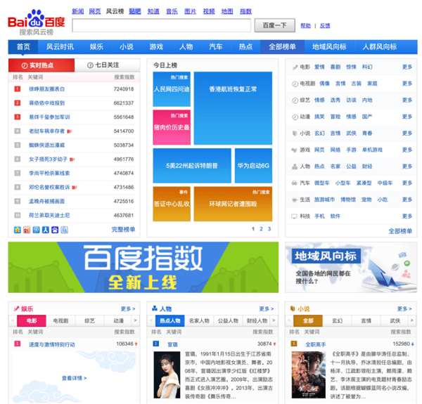 Sample Chinese website (baidu.com)
Western design tends to use more of a simplistic and cleaner visual expression, having more white space to draw attention to fewer objects, rather than the opposite. What the viewer is accustomed to usually determines what best catches the attention of the targeted audience—if you should go for the “less is more” principle or vice versa.
An example of what a more minimalistic design could look like:

Sample Swedish website (lindex.se)
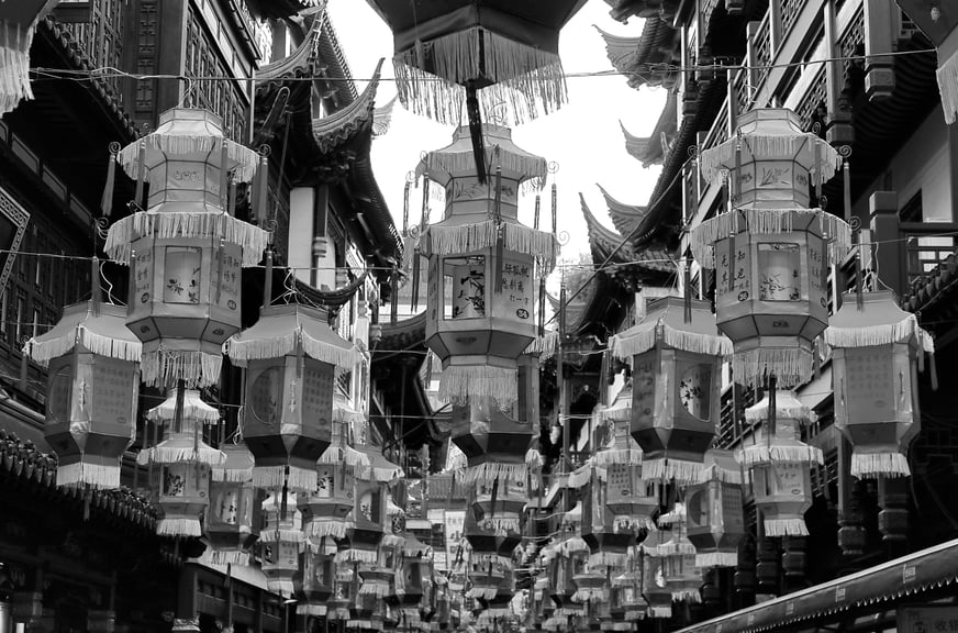
But white space usage is only one example. Colours is another, being a vast topic on its own. If you are used to a more minimalistic design language, you’ll be aware when the visual colour keys suddenly change from white, black and perhaps blue (not always, of course) to, in the case with China, a lot more of red and yellow.
Colours
Theory of the five elements
Since the dynasty eras, there have been common views on the use of colours. Going back, they were divided into five main colours being green, white, red, black and yellow. They also represent the five phases of transformation: wood, metal, fire, water and earth, as well as for the corresponding cardinal points: east, west, south, north and middle. Thus, the general colour perception was strongly influenced, and they are a very important element in Chinese design.
As an example, pay attention to the following colour symbolisms when putting together your next presentation for a Chinese audience.
Here are a few examples of what I’ve learned:
Red
In Western culture, red often has negative connotations, whereas in China, it’s the opposite. Red (fire) is the most popular colour in China, as you can see, for example, in the country flag. It is considered to represent luck, happiness, success and good fortune. You have probably seen the red envelopes, hong bao, for lucky money. People like to wear red at celebratory events such as weddings. So, why not add a dash of red in your presentation!
Yellow
Yellow is considered the most beautiful and prestigious colour in China. Yellow corresponds with earth and has traditionally represented power, royalty and prosperity. In Imperial China, this colour was reserved only for the emperors and has often decorated royal palaces, altars and temples. Yellow is also perceived as a colour for freedom from worldly worries, which is why the robes of the monks wear the colour today.
Green
Green represents wealth, hope, harmony, growth and purity. There is not much of a difference between Western and Eastern symbolism in this case. But, essentially it stands more for wealth, harmony, growth, eco-friendliness in the West, whereas it stands for pure, clean and unpolluted in China
White
White means purity in the West, but in China, it is an unlucky colour representing metal and is associated with death (it is the colour traditionally worn when mourning and when attending funerals). That does not mean that it is not used in graphic design, but it might be good to be aware of what it has traditionally been representing, and depending on which context you’re currently operating in.
Black
If white is the colour for mourning in the east, black is the colour associated with it in the West. Black in China represents money and power but can also have the meaning of feeling blue and being somewhat depressed.
Trying to express oneself in a new cultural context may quickly make you realise you are on thin ice if you don’t do your research right, which could cause what is intended to be a well-thought message to fall flat. Or be misinterpreted, for that matter. There is not necessarily a common ground when selecting images, tonality and expression for a presentation or a product packaging so it may be worth spending some extra time doing research of what is generally considered preferred visual keys and colours when targeting a new audience.
And don’t forget to check the numerology while you are at it—there is, for instance, a vast difference using a 4 and an 8 in a Chinese context.
Download our guide: The Chinese numerology